
Stappie
Summary
The challenge
How might we reduce the complexity of the PAWW-application process?
The solution
A new mobile-first design that guides users through the PAWW-application check process in a step-by-step and calm manner, making it easier to follow and reducing stress.
Project info
Team
Disciplines

UI design

UX design

UX research
Responsibilities
Tools
Initial target group
Insights brought
out a target group
shift
The research initially focused on first-time homebuyers. But after interviews with users, a mortgage advisor, and desk research, it became clear this group relies heavily on their social circle (especially parents) who often direct them straight to a trusted advisor. Starters also tend to feel overwhelmed and lack the confidence to go through the process independently.
The research initially focused on first-time homebuyers. But after interviews with users, a mortgage advisor, and desk research, it became clear this group relies That’s why the focus shifted to a new target group: existing homeowners looking to increase their mortgage for a renovation or to make their home more sustainable. This group is cost-conscious, motivated to avoid advisor fees, and more confident in managing the process themselves.heavily on their social circle (especially parents) who often direct them straight to a trusted advisor. Starters also tend to feel overwhelmed and lack the confidence to go through the process independently.

New target group research
Key insights on
hesitant users
Hesitant users want to complete the application themselves but tend to give up and turn to a mortgage advisor if the process becomes too complicated or overwhelming. They prefer a straightforward, hassle-free experience. Terminology and necessary steps need to be clear in order for them to feel confident throughout this complex financial process.

Do it myself

Too much effort? Picks the advisor

Need for clarity
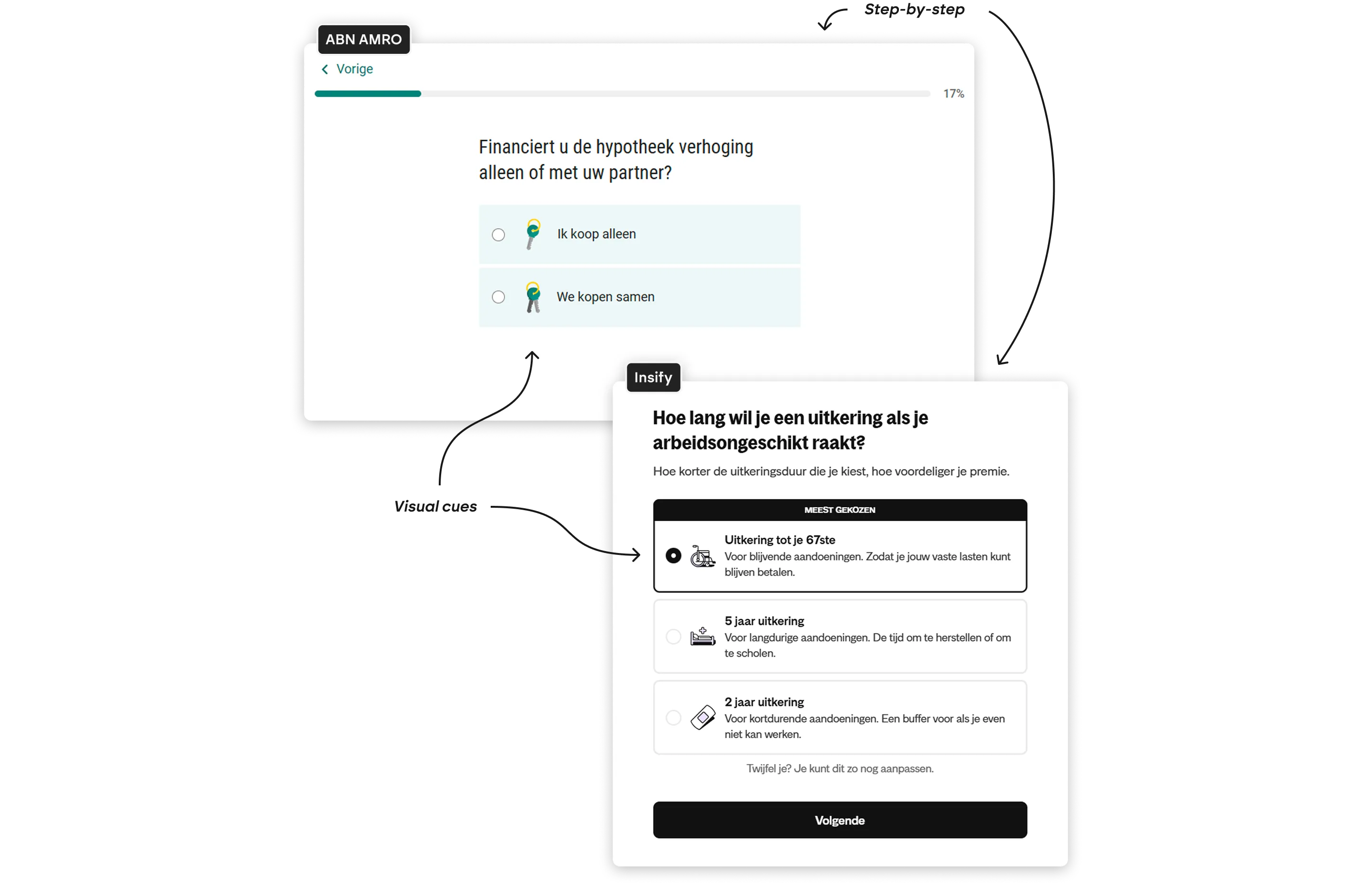
Market analysis
Competitors &
other sectors
Hesitant users need clarity and focus, so I studied how mortgage providers design their user flows and offer guidance through complex processes. I also examined insurance companies to identify effective step-by-step navigation and visual cues used in other financial sectors. And explored fashion websites for UX strategies like personalized recommendations and chatbot assistance to inspire fresh approaches.
Sketching
Ideation for the
mortgage module
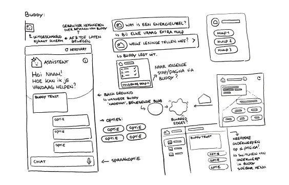
Digital assistent
Looking at chatbot assistance on fashion websites and exploring options.
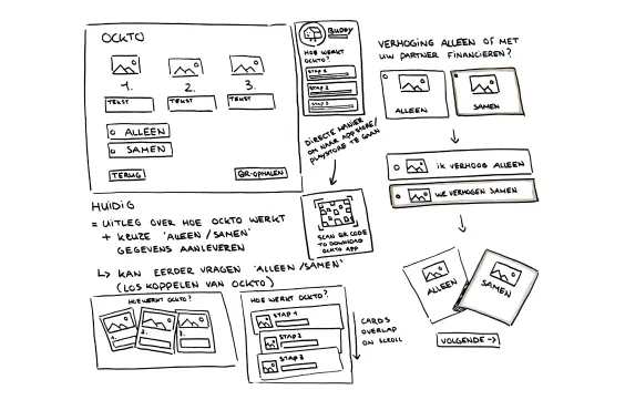
Retrieving data with Ockto
Ideas for redesigning the explanation screen for automatically retrieving data with the Ockto app.
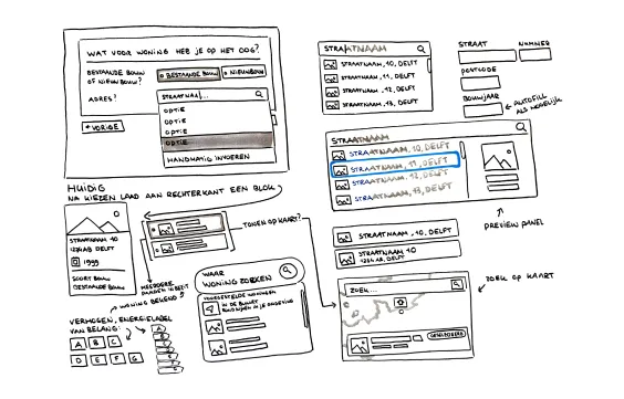
Searching for homes
Redesigning the search bar for homes and exploring components for energy label selection.
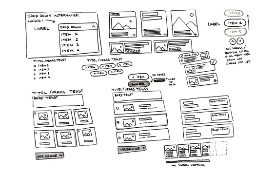
Standard components
Ideas for drop downs and selection components.
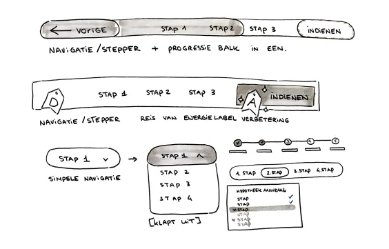
Nagivation
Ideas on steppers and task-based navigation.
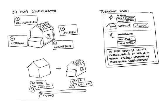
Configurator
Ideas for a 3D home configurator to create plans for your mortgage increase and visualize their impact on your house.


Experimenting
Finding a modular
visual style
I worked with the Deltsche’s design system, while keeping modularity in mind to allow rebranding across mortgage providers. Exploring different UX patterns such as step-by-step navigation, task focus, and assistant integration, resulted in two design directions.
The final direction emphasizes a layout that brings focus to the step the user needs to complete. This reduces cognitive load, keeps attention on the task at hand, and supports the guiding role provided by the digital assistant.
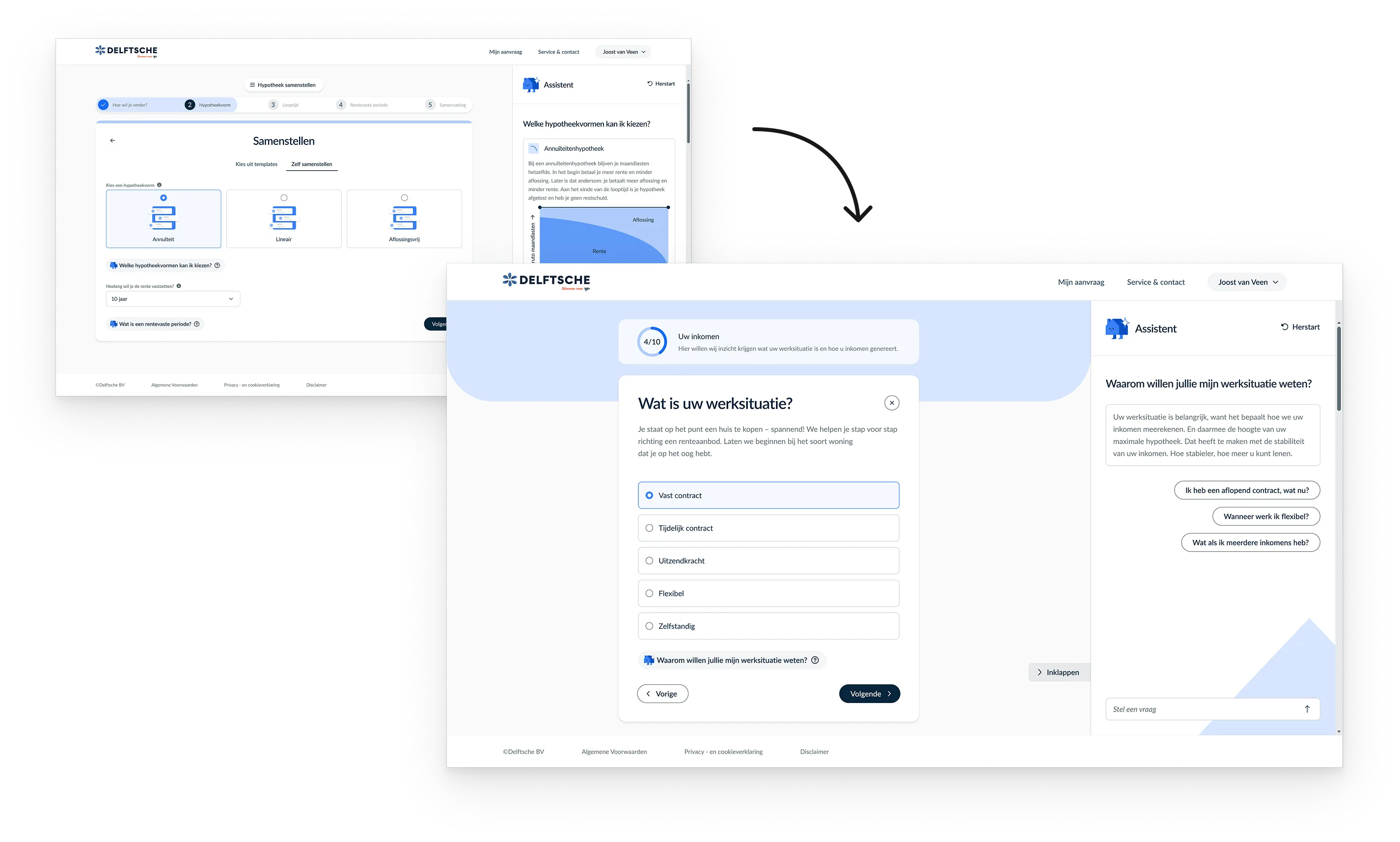
Chosing a layout that makes the current step stand out
Usability testing
Test results
User insights on
the process &
‘Stappie’
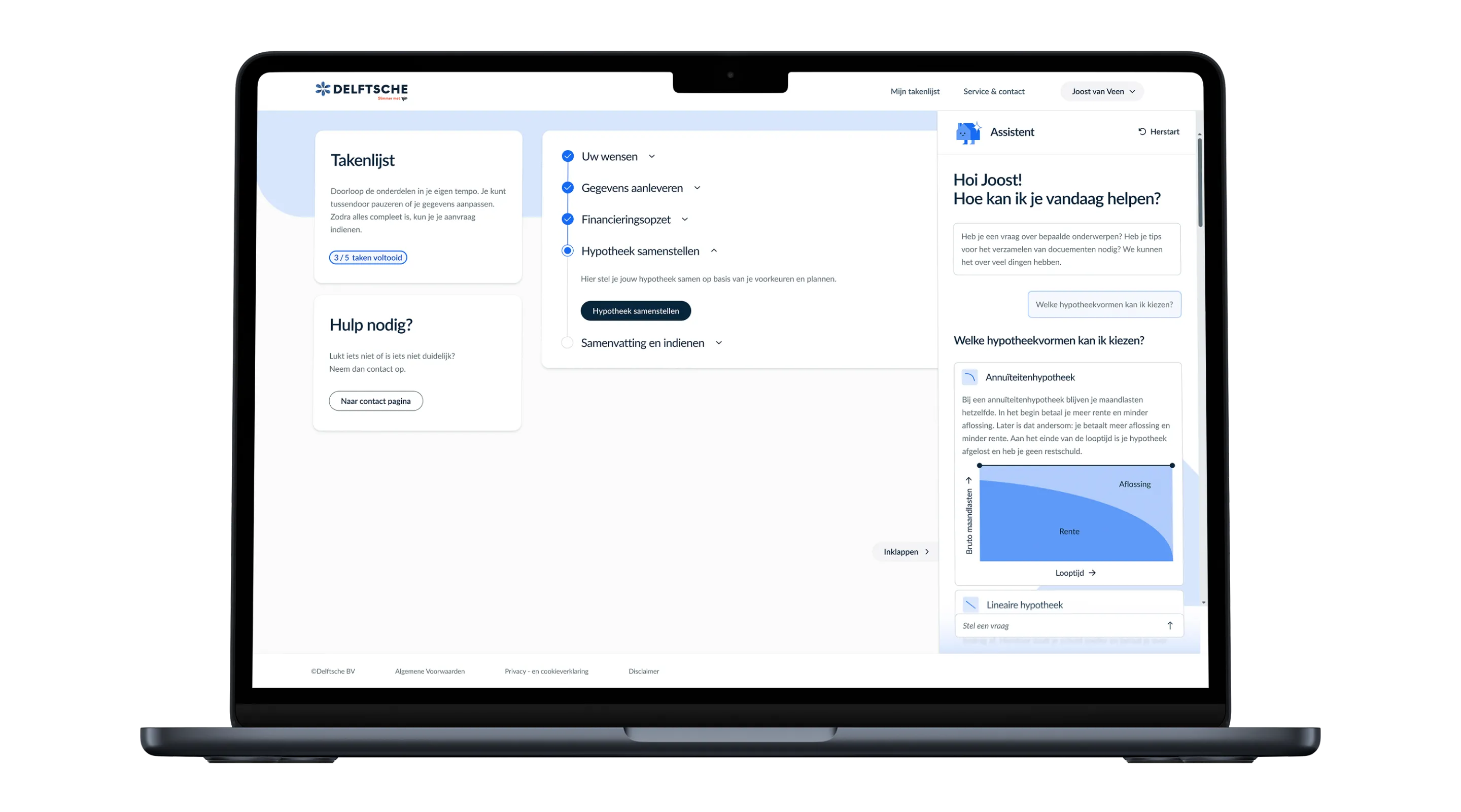
Users found the step-by-step, task-based process very clear and easy to follow. When they got stuck or had questions, they could ask Stappie for help. They appreciated that Stappie was available whenever needed but that they could choose when to interact with the assistant. Stappie was clear, helpful, and pleasant to use.
20
Users
Liked
The digital assistant
8.4
Average scoreout of 10
The final product
A ‘Stappie’ closer
to your mortgage
increase
The mortgage application module is divided into clear, digestible steps to help hesitant users focus on one decision at a time. This encourages informed decisions by reducing information overload. Stappie complements this by providing contextual information whenever users need extra guidance to make informed choices.
While chatbot technology itself isn’t new, its use in this specific context is. Stappie humanizes a complex financial process in a way competitors have yet to adopt.
What did I learn?
"Don’t be afraid to take on a challenge and shift focus to a new target audience"